Here’s How to Make It Work for You.
Every few years Apple overhauls the way iOS looks, and every time, a portion of its users are not happy about it. The iOS 26 “liquid glass” redesign, with its heavy translucency, frosted surfaces, and lighter overall palette, has been one of the more divisive visual updates in recent memory. Text feels harder to read, interfaces look washed out, and some buttons are genuinely harder to find than they used to be.
The good news is that Apple has quietly built a robust set of accessibility tools that let you dial back most of what you don’t like, without needing to jailbreak or wait for Apple to change course. Here’s how to use them.
The Two Settings That Fix Most of It
Open Settings > Accessibility > Display & Text Size. Two toggles near the top of this screen will make the biggest immediate difference:
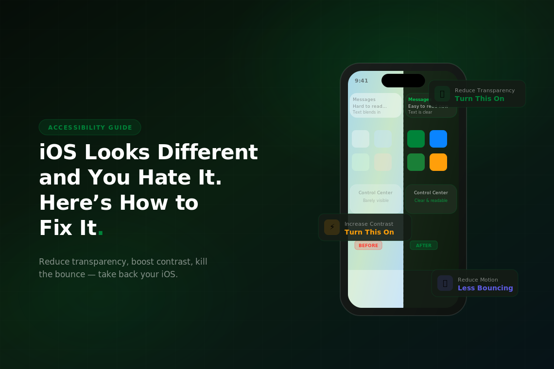
Reduce Transparency removes the frosted glass blur effect from system elements like the dock, folders, notification shade, and Control Center. Everything becomes solid instead of see-through. The visual effect is less stylistically interesting, but the contrast improves dramatically and text becomes noticeably easier to read. If the new iOS look was straining your eyes, this is the first thing to turn on.
Increase Contrast darkens the borders and background colors throughout the system UI, making buttons, cards, and interactive elements stand out more clearly against their backgrounds. The liquid glass aesthetic relies on subtle color shifts and transparency to imply depth, increasing contrast essentially forces those elements to be more explicit about where they are.
Together, these two changes transform iOS 26 from the airy, translucent look Apple shipped into something that reads much more like the older, more solid iOS interface a lot of people prefer. You lose some of the visual polish, but you gain clarity. For most people that’s a good trade.
Text That’s Actually Readable
If text still feels too small or too thin after reducing transparency, there are a few more tools in the same menu. Bold Text makes system fonts heavier throughout iOS; menus, labels, titles, and body text all get a weight bump. It’s a system-wide change that takes effect immediately and tends to pair well with Increase Contrast.
Larger Text is just below Bold Text, and it opens a slider that controls the Dynamic Type size used across apps that support it. This is different from the Display Zoom setting. Dynamic Type specifically affects text size inside apps, while Display Zoom makes everything on screen larger, including icons and interface elements. If reading is the issue, Larger Text is usually the right lever. If you want the whole phone to feel bigger, go to Settings > Display & Brightness > Display Zoom instead.
One setting that often gets overlooked: Button Shapes in the same Accessibility menu. The liquid glass redesign made many buttons look like floating text rather than tappable elements, which causes people to miss them entirely. Turning on Button Shapes adds outlines and backgrounds back to text-based buttons throughout the system, making it much clearer what’s tappable and what isn’t.
Motion and Animation
Another common complaint with the iOS 26 update is how the animations feel; the bouncier physics, the zoom transitions, the way elements spring in and out. For some people it’s delightful. For others it causes genuine discomfort, eye strain, or motion sickness.
Go to Settings > Accessibility > Motion and turn on Reduce Motion. This replaces most of the zoom and scale animations with simpler cross-fade transitions. The phone still animates, it just does so more quietly. App opens and closes, Control Center, notifications. All of these shift to gentler transitions that are less visually demanding.
Also in the Motion settings: Limit Frame Rate (available on ProMotion display models) caps the screen refresh rate at 60Hz instead of 120Hz. This doesn’t directly affect animation style, but it does reduce how fluid and attention-grabbing motion appears, which some people find helpful. It also has a small positive effect on battery life.
Color and Brightness
If the overall palette feels too bright or too washed out, Settings > Accessibility > Display & Text Size > Color Filters lets you shift the color temperature of the entire display. The Color Tint option lets you add a warm or cool overlay to the screen, which some people use to reduce eye strain in low light.
A more aggressive option is Reduce White Point, found in the same menu. This dims the brightest whites on the screen beyond what the normal brightness slider can achieve. On liquid glass interfaces where large portions of the UI are white or near-white, this makes a substantial difference in how harsh the screen feels.
True Tone and Night Shift are worth checking too. True Tone (Settings > Display & Brightness) adjusts the display’s color temperature based on ambient lighting, which can make a glass-heavy UI feel less clinical. Night Shift warms the display after sunset. Neither is an accessibility setting per se, but both soften the overall look of the interface in ways that complement the other adjustments.
Building a Setup You Can Live With
The honest reality is that Apple ships a single default visual experience and expects most users to live with it. The settings above exist because Apple knows not everyone can; whether that’s due to visual impairments, motion sensitivity, personal preference, or simply being accustomed to how iOS worked before.
A good starting combination for people who dislike the liquid glass look: Reduce Transparency on, Increase Contrast on, Bold Text on, Button Shapes on, Reduce Motion on. This setup keeps the basic structure of iOS 26 intact while removing most of the elements that generate complaints. The phone will look noticeably different from what Apple shipped, more solid, more readable, and more like a tool than a design statement, but everything will still work exactly the same way.
If you’ve gone through all of this and the phone still feels like a fight every day, it might be worth asking whether the device itself is the right fit. Older iPhones running newer iOS versions sometimes perform or display content differently than current hardware was designed to. Browsing used iPhones on Swappa is a practical way to move to a current model without paying full retail price. Every listing is verified functional before it’s allowed on the platform.
